
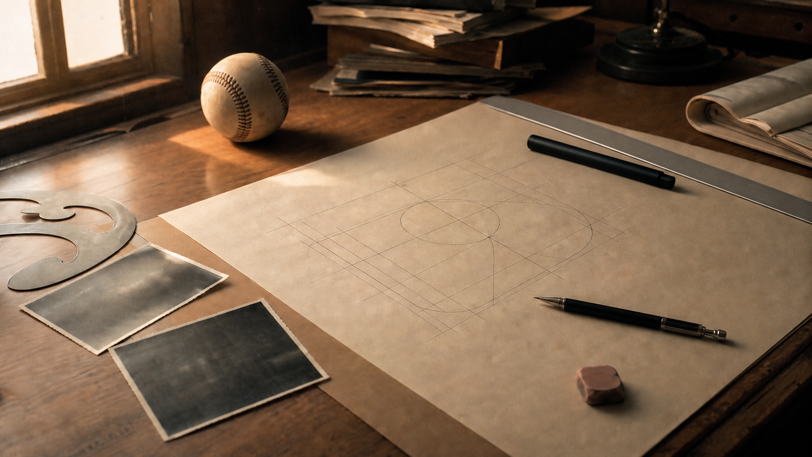
No player has been officially identified as the batter in the MLB logo. Graphic designer Jerry Dior created the mark in 1968 as a deliberately nondescript baseball figure, and it first appeared on Major League uniforms during the 1969 professional-baseball centennial. Harmon Killebrew is the name most often attached to the silhouette, but Dior repeatedly said he did not model it on Killebrew—or on any single player.
That distinction matters because the popular story combines a real Hall of Famer, an understandable resemblance and an unverified recollection. The documented design history points somewhere broader: the figure was meant to represent the sport as a whole. This guide separates what MLB and the designer confirmed from the parts that remain fan lore. For current baseball rather than brand history, start with the 2026 MLB schedule.
Who Is the Player in the MLB Logo?
The official answer is no one in particular. MLB's own history identifies Dior as the designer and describes the central figure as intentionally ambiguous. In interviews, Dior called it a composite or nondescript batter rather than a portrait.
He did use baseball photographs while developing variations, but using reference images is not the same as tracing one specific photograph. A designer can study the angle of a bat, the balance of a stance and the negative space around a helmet, then simplify those details into a new figure. Dior's brief required a symbol that would work across the entire league, so making one star the permanent face of the mark would have worked against that goal.
The silhouette also contains too little identifying information to prove a player from appearance alone. There is no visible face, uniform number, club insignia or distinctive equipment. Even the direction the batter faces can change depending on how the viewer interprets the foreground and background. Visual resemblance can start a good baseball debate, but it cannot override the designer's account.
That league-wide reading still fits the mark today. It sits above all 30 organizations rather than belonging to one franchise, era or position. Readers who want the clubs behind that shared identity can use our MLB teams list by division.
Why Harmon Killebrew Became the Leading Theory
Harmon Killebrew was a plausible candidate in the public imagination. The right-handed slugger had a compact, powerful stance and was one of baseball's defining home-run hitters when the logo was commissioned. He later entered the National Baseball Hall of Fame after finishing his career with 573 home runs.
Killebrew also had a story behind his belief. He recalled seeing someone working with a photograph of him during a visit to the commissioner's office, then noticing that the league's new symbol looked similar when it appeared. The bat angle was not identical, but the resemblance was close enough for him—and later generations of fans—to connect the two.
The problem is provenance. Killebrew's recollection did not establish that the material he saw became Dior's design, and Dior directly rejected the proposed connection. In MLB's account, the designer said the figure was not Killebrew and was not any other particular player. ESPN similarly reported Dior's categorical denial when revisiting the theory in 2011.
The fairest conclusion is therefore narrow: Killebrew sincerely believed the image might have been inspired by him, but the claim is not confirmed and conflicts with the designer's testimony. Calling him “the MLB logo” turns an enduring theory into a fact that the historical record does not support.
Who Designed the MLB Logo?
Jerry Dior designed the mark while working for the New York firm Sandgren & Murtha. Major League Baseball commissioned a new identity for the 1969 celebration of 100 years of professional baseball. According to Dior's later interviews, the assignment reached him because he was available, not because a months-long competition had been organized around a famous player.
Dior worked quickly. He recalled producing the concept and variations in roughly half a day, using a magic marker and ordinary baseball photography as visual reference. The design needed to read immediately, reproduce cleanly and avoid details that would tie it to one club or athlete. Commissioner Bowie Kuhn selected the concept, while MLB chose the red, white and blue treatment associated with the finished mark.
The speed of the assignment can make the result sound accidental, but the choices were disciplined. A simplified batter communicates baseball without relying on a wordmark. Strong areas of positive and negative space survive when the image is reduced for a uniform patch or enlarged for a stadium sign. Removing facial and uniform details also lets viewers recognize the sport before they begin asking who the player is.
For decades, Dior's authorship was much less familiar than the symbol itself. MLB formally recognized him in 2009 with ceremonies at Yankee Stadium and Citi Field, helping settle who designed the mark even as the identity of its fictional batter continued to attract speculation.
When Did the MLB Logo Debut?
Both 1968 and 1969 appear in accurate histories because they describe different milestones:
- 1968: Dior created the design and MLB selected it.
- 1969: the mark was used for the professional-baseball centennial and began appearing on Major League uniforms.
So “designed in 1968” and “introduced in 1969” are not contradictory. One is the production year; the other is the public debut tied to the centennial season.
The familiar batter mark also should not be projected backward onto all of baseball history. Before it existed, individual clubs and the American and National Leagues already had their own visual identities. MLB's 1968 commission created a new unifying league symbol; it did not erase those team and league marks or produce a simple one-for-one replacement timeline for every earlier baseball emblem.
The centennial concept was initially connected to a one-year celebration, yet the design proved too useful to retire. It became a permanent part of the league's identity and eventually appeared far beyond uniform patches. For a modern contrast, see when the 2026 MLB season starts and how Opening Day is organized now.
Is the MLB Logo a Righty or a Lefty?
It can look like either one, and that is intentional. Dior removed enough perspective information that the viewer can interpret the batter from two sides. If the figure is understood as showing his back to the viewer, the stance reads as right-handed. If the same shapes are understood from the front, the batter can read as left-handed.
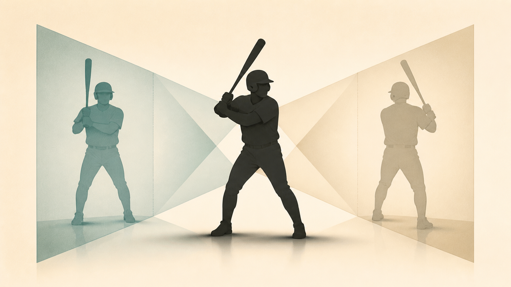
The head is the key to the illusion. A small protruding shape might be read as a nose and face, or as part of a helmet profile viewed from the opposite direction. The torso and arms do not supply enough depth cues to force one interpretation. Once the brain chooses a viewpoint, the bat and hands seem to confirm it—even though another viewer may make the opposite choice.
There is therefore no hidden official batting side to discover. The ambiguity was part of Dior's effort to avoid identifying one athlete. It allows left-handed and right-handed players alike to see a plausible hitter, and it keeps the conversation centered on baseball rather than on one fixed portrait. To compare the visual puzzle with real lineups, check the MLB games today page.
Why the MLB Logo Has Lasted
The mark has lasted because it solves several design problems at once. It communicates the sport quickly, remains legible at very different sizes and belongs to the whole league. A detailed illustration could age as uniforms, helmets and graphic styles changed; the simplified batter avoids most of those era-specific cues.
Its ambiguity is also inclusive in a design sense. The figure has no visible club, number, face or confirmed batting side. Fans can recognize an archetypal Major Leaguer without being asked to accept one franchise's star as the permanent representative of every team.
Longevity does not mean every production detail has remained frozen. Colors and surrounding wordmark treatments have been refined over time. CBS Sports reported that MLB darkened the red and blue and removed the accompanying “Major League Baseball” wording in a 2019 version, while retaining the central batter concept. Those are adjustments to presentation, not a replacement of Dior's underlying idea.
The result is a rare sports identity whose creation story is simpler than the mythology around it. A designer received a practical centennial assignment, built a universal silhouette and deliberately left out the very clues fans now search for.
MLB Logo History FAQ
Is the MLB logo based on Harmon Killebrew?
Not officially. Killebrew believed the silhouette might have been inspired by him, but designer Jerry Dior said it was not based on Killebrew or any single player. The Killebrew connection is best described as a popular, unproven theory.
Who designed the MLB logo?
Jerry Dior designed it in 1968 while working at the New York design firm Sandgren & Murtha. MLB commissioned the identity for the following year's professional-baseball centennial.
Was the MLB logo introduced in 1968 or 1969?
It was designed and selected in 1968, then appeared publicly for the 1969 centennial and on Major League uniforms that season. The two dates refer to design and debut.
Is the batter right-handed or left-handed?
There is no single official answer. The perspective is intentionally ambiguous, so the figure can be read as a right-handed batter seen from behind or a left-handed batter seen from the front.
Can I download an official MLB logo PNG from this page?
No. This is an independent editorial history, not an official brand-asset library, and it does not distribute MLB logo files. Businesses, publishers and merchandise creators should obtain current artwork and permission through Major League Baseball's official licensing or brand channels rather than copying an image from a search result.
Loading comments...